Liquitex Heavy Body vs Ink Set: A Buyer's Breakdown After 5 Years of Ordering Art Supplies
-
Start With Liquitex Heavy Body, Not the Ink Set
-
Why I Started Doing TCO Math
-
The Counterintuitive Result: Expensive Tubes Were Cheaper
-
What Heavy Body Gives You in a Classroom
-
When the Ink Set Earns Its Place
-
When To Flip the Order and Buy Ink First
-
Three (OK, Four) Technical References I Actually Use
-
The Same Logic Follows Me Around the Job
-
What I Haven't Figured Out
Start With Liquitex Heavy Body, Not the Ink Set
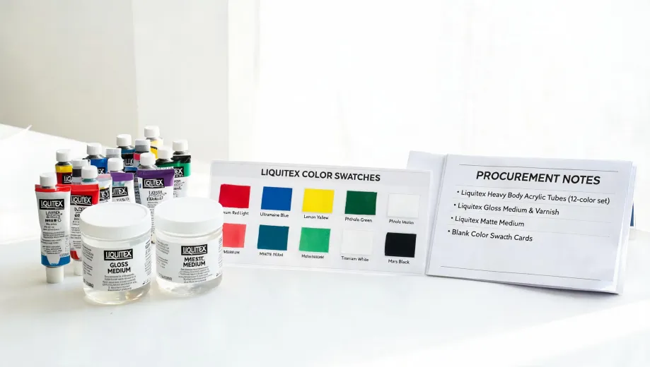
If you're stocking a shared studio, classroom, or art department, start with Liquitex heavy body acrylics—not the ink set. Ten colors of heavy body will handle roughly 95% of the work in a typical painting course, and the cost per student-hour ends up lower than budget paints once you count reorders, wasted time, and frustrated students.
The Liquitex ink set is a great specialist tool for printmaking, illustration, and airbrush work. But it's not a foundation purchase. Add it when a specific course actually requires it—not before.
I've spent five years buying art supplies for a visual arts program serving 400 students across three campuses, managing roughly $85,000 a year across 14 vendors. That experience taught me that unit price tells you almost nothing about what a product really costs. The expensive tube was the cheaper purchase—and below I'll show you the math.
Why I Started Doing TCO Math
In my first year on the job, I made the classic rookie error. I assumed "student-grade" paint from a budget brand was just a thinner version of a professional line. I saved about $2,000 on the semester order, which looked great in my quarterly report to finance.
Then students started complaining that their mixed colors turned gray and muddy. Two instructors separately described the paint as "watery paste." Three weeks into the term, I placed an emergency reorder of Liquitex heavy body—$1,460 I hadn't budgeted for.
That's when I stopped looking at unit prices and started looking at total cost. The $2,000 I "saved" was gone, plus another $1,460 in reordering, plus three weeks of frustrated students and instructors who lost trust in my purchasing decisions. That last part is the cost that doesn't show up in a spreadsheet.
I now run a simple calculation before I compare any vendor quotes:
(Total product cost) ÷ (number of students × hours of actual use) = cost per student-hour
That number, not the sticker price, is what tells me whether a purchase was a good decision.
The Counterintuitive Result: Expensive Tubes Were Cheaper
Let me walk through a real example. Our Painting I students each get a set of 10 colors for a 14-week semester with 2-hour sessions. Here's how the math shook out in our context:
- Budget brand: About $8 per tube × 10 colors = $80 per student. Coverage was thin, so students used more to get opacity. Mixed colors looked dull, so instructors spent extra class time re-demonstrating color theory. Then the paint failed mid-semester, triggering a $1,460 reorder.
- Liquitex heavy body: Roughly $12 per tube × 10 colors = $120 per student. Coverage was one-coat, mixing behavior matched the color charts, and we didn't need a mid-semester rescue order.
Do the division and the "cheap" path cost about $7.31 per student-hour after everything fell apart. The Liquitex path ran about $4.50 per student-hour. The more expensive tube was the cheaper purchase. That still sounds wrong to me even though I've verified it twice.
People think expensive vendors deliver better quality because they charge more. Actually, it's the reverse: vendors who invest in better materials can charge more because the quality is real. The price is a result, not a cause.
What Heavy Body Gives You in a Classroom
Liquitex heavy body is thick, buttery acrylic paint. It holds the mark you make—a palette knife stroke stays a stroke, a ridge stays a ridge. For teaching, that's huge. Students can see exactly how their tool and pressure change the paint. That's not a luxury; it's how painting fundamentals get taught.
A few things I've learned from five years of watching instructors use it:
- One coat covers. Students don't need to re-paint an area three times, which saves class time and keeps colors bright.
- The mixing behavior is predictable. Blue plus yellow makes green the way the color wheel says it should. Cheap fillers make muddy brown instead, and students learn the wrong lesson.
- Cadmium-free options are real. Colors like Cadmium-Free Yellow Medium and Cadmium-Free Red Medium exist in the heavy body line. That's a genuine advantage for institutions that do routine safety reviews of classroom materials.
- Open time is about 10–15 minutes. Enough to blend a passage, quick enough that students don't waste a 2-hour session waiting for paint to dry.
Our standard order is nine colors plus titanium white: white (two tubes for every one of everything else—you'll burn through it), carbon black, cadmium-free yellow medium, cadmium-free red medium, quinacridone magenta, phthalo blue (green shade), phthalo green (blue shade), burnt sienna, and raw umber. That palette covers nearly every mixing scenario in a foundational painting course.
When the Ink Set Earns Its Place
Now let me talk about the Liquitex ink set, because I like it. It's concentrated, highly fluid acrylic ink that works for dip pen line work, airbrushing, washes, and mixed media. The 6-color set is a reasonable starting point, and the colors mix well.
But here's the thing: it's a specialist tool. A classroom will burn through heavy body paint in weeks, while a bottle of ink can last a whole semester. That isn't a criticism—it's a feature for printmaking and illustration courses. But it means the ink set is an addition, not a foundation.
I have mixed feelings about recommending it for institutional purchase. On one hand, it's the exact product my illustration instructors ask for. On the other, it will sit unused if the syllabus doesn't include specific ink projects. We ordered two sets for a printmaking class one semester, and both bottles ended the term mostly full—the instructor was demonstrating more than assigning. We should have checked the syllabus before ordering.
Dodged a bullet last spring when I double-checked the course syllabus before approving an ink order. I was one click away from buying four sets instead of two. The two unopened sets from the previous semester would have sat another year.
When To Flip the Order and Buy Ink First
Not every classroom should start with heavy body. Here's when I'd switch:
- Your core course is printmaking or illustration. If students are using dip pens, airbrushes, or doing book arts, inks are the backbone of the curriculum. Heavy body becomes the support act.
- You're teaching advanced students. Beginners need the predictable behavior of heavy body to learn fundamentals. Advanced students have the control to handle fluid inks without painting the room.
- It's a mixed-media studio, not a painting studio. In a general art room, inks stretch across more types of projects. Heavy body is still valuable but not the first purchase.
And a related warning: check how many sessions actually involve paint before you commit a big budget. One spring I invested heavily in heavy body sets for a design department that turned out to need only two painting sessions that entire semester. The tubes sat in a cabinet. My TCO framework didn't fail me—my assumptions about the syllabus did.
Three (OK, Four) Technical References I Actually Use
When the health and safety office or finance questions a purchase, I don't argue from opinion. I use these:
1. Pigment index and lightfastness ratings. Liquitex publishes pigment index numbers and lightfastness ratings for each color. For classroom purchases, I only buy colors rated I or II for lightfastness. That's the professional standard, and it keeps student work from fading.
2. Delta E color tolerance. If a project needs brand-consistent color, the industry benchmark is Delta E at or below 2 for critical colors; above 4 is visible to most people. When "close enough" isn't close enough, this standard settles the argument. Reference: Pantone Color Matching System guidelines.
3. Print resolution standards. When students reproduce painted work digitally, the minimum for commercial offset printing is 300 DPI at final size. Large-format pieces can drop to 150 DPI. I tell instructors to set up their photography and scanning lessons at 300 DPI from day one, so nobody ends up with mural-quality work trapped in a 72-DPI file.
4. Paper weights. When I order printing paper or canvas, I check GSM rather than trusting labels like "premium." The math is straightforward: 20 lb bond is roughly 75 gsm; 80 lb cover is about 216 gsm. I've caught two vendor quotes that tried to pass off standard stock as "heavyweight" using this check.
The Same Logic Follows Me Around the Job
I've realized this TCO mindset applies way beyond paint. The same week I calculated cost per student-hour, I helped an instructor find the IP address on a printer—it's under the touch panel, Settings > Network, not in the manual, which is three revisions outdated. And every semester, someone asks me to double-check the weighted grade calculator spreadsheet because one miscounted percentage causes more office drama than a thousand muddy paintings.
I even use the logic at home. My retirement projections run through the Dave Ramsey calculator because it makes conservative assumptions about returns—I'd rather expect less and get more than the other way around. That's honestly the same reason I keep choosing Liquitex heavy body: the predictability is worth more than the savings. Predictability is a feature. Surprises are a cost.
What I Haven't Figured Out
Let me be honest about the limitations of all this. My numbers come from my specific context—a public school with contract pricing, students in a particular region, and a climate that affects drying time. Your costs, students, and facility are different. I have not tested every Liquitex product, and this article doesn't cover soft body acrylics, fluids, mediums, or brushes, each of which has its own logic.
The framework transfers. The exact palette might not.
So here's what I'd recommend: buy a few tubes of Liquitex heavy body, test them in your studio for a week, and run the cost-per-student-hour calculation on your own numbers. Then decide. That's what I do with every product category I'm unsure about. It's been five years, and I haven't found a more reliable way to choose.

Elena Baptista
Elena Baptista is an office printing and imaging analyst covering laser and inkjet printers, multifunction devices, copiers, label and receipt printers, ink cartridges, toner cartridges, and drum units. She applies ISO/IEC 24734, ISO/IEC 24711, and ISO/IEC 19798 methods while comparing print speed, first-page time, duplex throughput, duty cycle, page yield, coverage assumptions, resolution, color consistency, energy use, and maintenance intervals. Her guides help offices, schools, dealers, and procurement teams match output volume, media handling, connectivity, consumable economics, service access, and fleet-management requirements.